Work UI Design
Jun 2023 - Aug 2023
Bendik Berntsen
Ca. 114 wireframes Web & Mobile
Navigating through nav.no can be quite a journey. Despite a robust design system, the absence of clear guidelines has led to noticeable variations across the interface.
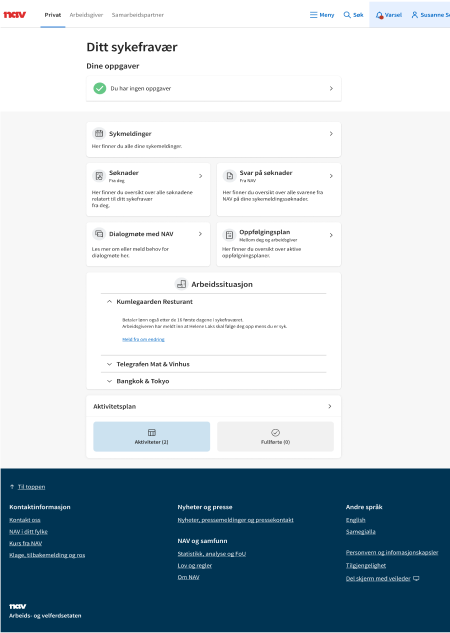
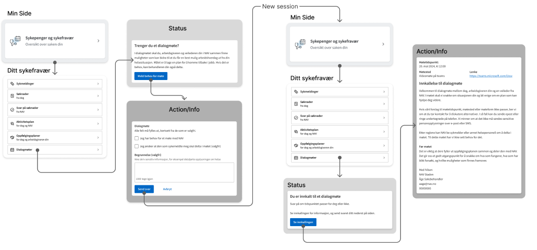
With no one to oversee the visual cohesiveness of NAV´s massive website, small UI variations are bound to arise. The variations have been a source of frustration for designers within the product area Health, though due to various factors it was never prioritized. Following the guidance of a senior product designer, I undertook the redesign of "Ditt sykfravær" and its sub-sites to align with the newly revamped "Min side." While the concept was well received by the other designers, uncertainty about ownership, a lack of resources and shifted focus led to that the project didn’t develop past the high fidelity sketches.
As the old saying goes, “Too many cooks spoil the broth”. While “Ditt sykefravær” and it’s services are seemingly similar at first glance, upon closer inspection visual disparity starts to emerge.


NAV’s “Min side” launched a new design, causing “Ditt sykefravær” to look distinctly different. At best people may think that “Ditt sykefravær” is outdated, at worst it may lead to confusion and undermind people’s trust.
Updating the original design to match “Min side”.


Using the original site as a starting site for the redesign.


